When interested in drawing comic art, usually people go for comics in panels. Now, the comic panels is considered to be a single frame in a multiple-panel sequence you find in stories in comic books or comic strips, or if the single panel contains the whole thing like in newspapers, then the panel is the story (or usually joke) itself, and is called a “single panel comic”. When talking about panels in comic strips, these comic panels are distributed within the pages of the book, and will be the house for your drawing and storyline. People who are just beginning to make comic strips usually overlook the basic considerations that every comic book artist should be able to make. Fact is it’s not all about the drawing. You should also consider comic paneling,comic layout, and the storyline of course. The art of good comic paneling is one of the fundamental skills every comic book artist cannot live without.
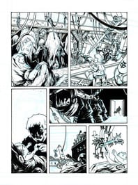
First up, panel sizes depend on the importance of the scene you are trying to create. For example, the dramatic scene after a drastic action scene is given a big frame, while small scenes with a one-man thinking dialogue can get a smaller frame. Margins are also important when making comic panels, for one should be able to distinguish one frame from the other, and not look at it as one big frame, which would be confusing. Single lines are okay when you want to try to connect the two panels in some way, but you have to make sure that it is clear that those are two separate pieces. Usually, spaces are put in between panels to signify that they are different, but in sequence. Some people also are used to shading the next panel of the story so one can clearly distinguish that the panel is not one with the last, but is continuous.
Comic layout is just as important as the storyline. It assures the smooth transition of panels without mixing up the readers mind. There are a few guidelines to these as well to ensure that the reader will definitely be reading on until the last page.
Bubble Placing

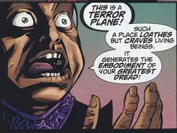
When doing layout for comics, speech bubble placing is very important. First, you have to consider its size, and how much information or conversation you are willing to cram into that bubble. Big speech bubbles are unavoidable, but you have to make sure that they do not fill most of the panel wherein you are drawing, for even if the story line is important, you wouldn’t want your comic to seem like a book. Don’t make too large bubbles because it might get in the way of your drawing. A good idea would be to break up the bubbles into two separate panels, that way they wouldn’t take too much space, and your characters (and readers) can breathe. People break up bubbles for a lot of reasons. Aside from breaking up really long conversation pieces, they also do it to signify a break, or a pause, in the character’s “voice”.
Since comics have no audio involved, the reader should feel that the characters can speak, and this involves them taking a breath. Therefore, people sometimes put bubbles in another part of the panel, to signify that the thought was said after the first. Be careful with this placing that it will not confuse the reader of the sequence of the conversation.
That brings us to another thing to address when it comes to comic book layout. I’m talking about the compositional flow and dialogue sequencing, which is placing the right bubbles at the right measure of space to indicate the flow of the conversation. Different kinds of comics require different sequencing, for example, I understand that anime comics are read differently from other kinds of comics, so it’s a basic need to know what kind of comic you are making, and how readers actually read that comic. If you are an English reader, it is just natural to read from top left to bottom right, so it is essential to place the speech bubbles in a way that the reader gets the flow of the conversation easily, which would be top left to bottom right. Once they have established that, you should now be consistent all throughout the story, to avoid confusion and mix-ups. This is to ensure that the reader gets the gist of the comic even without dialogue, because the eyes are already drawn to the direction of the story flow.
Recommended Books
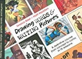
Drawing Words and Writing Pictures: Making Comics: Manga, Graphic Novels, and Beyond by Jessica Abel
Even if this was quite a big book and thus, hard to handle, it contained a lot of information starting from sketching, using pencils to sketch, making different sketches, how different artists do their work, how do you actually tell a story with pictures.
It is good for a beginner, someone who likes to learn how to do comics, and for someone who likes to see e.g. how to draw a character and how to use those little wooden helpers to do that etc. I would recommend this for anyone who likes comics and likes to know how to draw a comic and tell a story in pictures.
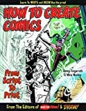
How To Create Comics, From Script To Print by Danny Fingeroth & Mike Manley
This is a very complete guide to making a comic book quite literally from start to finish. The authors actually create an actual original comic and take you through the entire process start to finish. Brainstorming concepts and characters, story, concept sketches, script, sequential art, inking, coloring, lettering, printing, even marketing and distribution is covered. The examples provided are very worthwhile. They show the script and right next to it the comic page to show you how it goes from words to sequential art. Each step is very detailed: considerations for writing and drawing, options for script formats, what tools to use and how to ink, the steps involved in using Illustrator to do the lettering, etc. It’s all here.
Please visit our friends at GPSTS.org who support CreativeComicArt.com! Read their review of the top rated Americas Cardroom at https://gpsts.org/americas-cardroom-bonus-code-review/.
Leave Some Feedback!
Submit your review | |
cool
cool
I just wanted to note that I stumbled across this page as I was looking for some erudition on or elaboration on the simple rationale for panel strips; i.e. most notably, as in the newspaper strips. Typically they're 3 or 4 panel strips, sometimes just two and even just the 'single panel' strips. A single panel strip, obviously (to me, anyway) informs that you have a single gag or joke to impart; there's no continuity or buildup, and a single panel serves its purpose. More traditional works like Peanuts or any other daily humor strip will have 3-4 panels to develop the joke. Or pithy observation. This format obviously suits the nature of the newspaper (for those who still read those archaic tabloids) because it's designed to be quick, to the point, get it and get out to the next strip. The payoff is often the joke, and for the continuing yet dearth of 'adventure' strips, an advancement in the storyline. But for our purposes, we're talking about a humor strip like Doonesbury or Peanuts or what-have-you.
With newspaper cartoon strips on the way out (sadly), is there room for...longer strips? I've been working on, fairly regularly, a cartoon series which is a two-tier format, typically 3 and 3 above each other, and I'm doing it that way...well, because I can and I want to. The first panel is usually open and has the title for the strip usually some hopefully amusing or ironic observation for the gist of the strip. Then...I have 5 panels to develop the story. Sometimes it's a long-winded set up for a gag; sometimes it's simply...I want to draw whatever I want and be damned what you think; it's been even an observation of how much an old man farts and how little he cares, and how his wife still is embarrassed by it. WhatEVER!!
In any case, I'd hoped for a short talk about this with the inherent differences between a one-panel, 2-4 panel, etc layout and how the panel count can affect the final result. But Ikinda started doing it on my own. Oh, well. I'll try out your other pages sometime. Looks good.
cool


