Usage + Wear and Tear
Logically, regular use of an equipment or tool results in its value or quality degrading or aging. The process can be called “wear and tear”. Aside from showing that the equipment has degraded or was used, the “wear and tear” also shows that the tool has seen action and basically has done what is was supposed to do.
Take a shield for example, if a shield was struck upon or used to bludgeon a target, the surface of the shield would be scratched, dented, or chipped showing that it was used and served its purpose.
Of course the wear and tear does not affect only equipment and armor/costumes.it can also be applied to characters but is viewed quite differently. We have mentioned before how the wear and tear are a process of degradation and aging, but when used on a character, he or she is portrayed as a wiser individual with experience and a specialist in his or her own field. Here are a couple of example from the animated Star Wars series:
In Star Wars: Clone Wars, a group of new recruit clone troopers (as well as cadets) were called “shinies”. The were called as such because of their brand new shining armor, which in a way shows that they have never been in combat before and lacks combat experience.
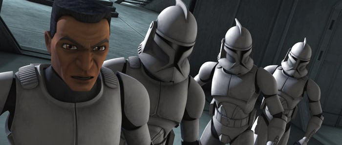
Then there is Commander Wolffe. A clone trooper commander who after an encounter with a Dark Jedi, lost his right eye and replaced with a cybernetic eye.A veteran of countless battles, Commander Wollfe wear his signature battle-scarred armor and regular clone trooper gears.The scar on his right eye can be clearly seen when he is not wearing his helmet.With a fearsome reputation, Commander Wollfe leads and serves as an inspiration to all other clone troopers on the battlefield.
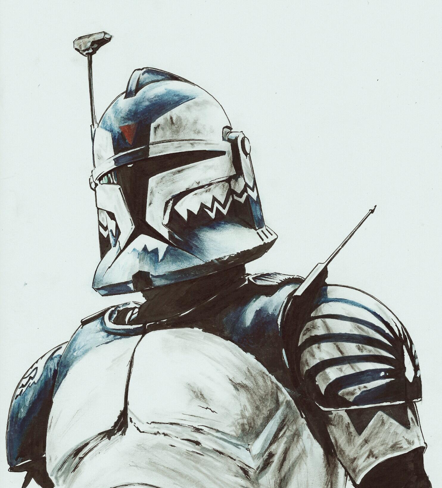
Now, given the two pictures with what was said on the two very different group of people, can you figure out who is a clone trooper recruit and who is Commander Wolffe? Who is more experienced than the other?
The fact that these clone trooper recruit has new shining armor and combat gears, it is only natural for people to assume that they are inexperience.And given the rank of commander and wearing the battle-scarred armor in addition to the scar on the face, it is pretty obvious that Commander Wolffe is more experienced as well as a veteran of war.
Logically, characters who are physically involved in dangerous situation such as soldiers, warriors, vigilantes, barbarians, thugs, criminals all have a fair share of battle-scars, injuries or wounds that show how they have seen action and are experienced.This should be shown and emphasized on to separate them from the rest.
Shading and depth of detail play a big part in creating realism in your work.If you put enough detail on the affect of wear and tear on your equipment, armor/costume, a character’s facial feature or body part, you will see how a few shading and crosshatching techniques can put out a great sense of realism to your work.But much like everything else, the best way for you to polish this particular skill set is by constant practice and research.If you are consistent in creating a sense of realism in whatever you draw, people will be able to relate to it and automatically be drawn to your art and ultimately your comic works.
Form Follows Function
The principle is pretty easy.
The basis of form follow function principle can lead to two things: practicality and logic.It basically means that whatever design you come up with, it must always look like it would work with little or no restriction. The design must be practical, reliable and easy to explain in its purpose.Failure to follow this can lead to people questioning your design, which is the last thing you want them to do. In the process of creating a design, ask yourself these questions-
Does the design serves its purpose or is it just for show?
Does it restrict your character’s movement or actions?
These questions may contribute to the final design. For example:
This is a pair of boots. As you can see by the design, they are not just a pair of ordinary boots but instead look like a pair of brutal combat boots. At first glance, you might not see the design flaws that are showing but if you look closely and ask the same questions above, you will notice the design mistakes that were made. Lets try it out –
Does the design serves its purpose or is it just for show? –
By the look of things, the boot does serve it purpose but it has something for show as well. The basis of the design looks to be from a combat boot. With that, the character wearing it is most likely in a dangerous, warlike, survivalist situation. The sturdy, durable and thick look of the boot will no doubt protects the wearer and keep him/her from harsh environment. The spikes added to the boot will most likely help the wearer in combat as well as intimidating anyone who tries to mess with the wearer. Of course, you would not want to talk trash to someone wearing boots likes that unless you are really ready of him or her using it.
Does it restrict your character’s movement or actions?
On second thought, the spike on the sides of the boots can actually hurt the character wearing them if he/she decides to run or even raise the leg to kick. It may not be a good idea after all.
Now this is a design flaw and it contradicts with the form follows function principle. Instead of scraping the design, lets make some small changes to the spikes.
We decided to change the spikes on the inner sides and replace it with a stud instead of removing it altogether to maintain that sense of intimidation.There, now it is safer for the character to use the boot.The character can now run, kick or jump any way he or she sees fit with that boot.
Pretty simple right?
The solution comes smoothly if you sort the basis of form follows function – practicality and logic.The simpler approach toward this is to put yourself in the character’s shoes.How? Simply ask yourself if you would have any problem with the design if you are to wear or use them.
Would you wear a pair of boots that restrict you from running or kicking?
Would you carry a big sword that is so heavy, you could barely lift it with two hands?
We hope that you now have a better understanding of how the form follows function principle works and relate to how your designs could change just by taking into account on how it works.Always design or create something that looks likes it is going to work with as little explanation as possible.
Is it logical? – In some cases, logic doesn’t really count because in comics, other factors such as superpowers, magic, gadgets, other worldly materials …etc , usually contributes to the logic of how things are or should be being set aside. If this is the case, then it will go a long way if you could explain a little bit about. Let’s take another Star Wars example:
In the Star Wars Universe, a lightsaber could cut through anything and going melee against someone with a lightsaber without using one or have any powers could lead to losing a limb or two. One material that is known to withstand a lightsaber hit is a rare metal ore called Mandalorian iron, or Beskar in the native tongue of Mandalore. The iron can be forged to weapons or armor and lightsabers does little or nothing against them. Because of the material’s resistance, Mandalore weapons and armor are known to be used to counter lightsabers user should there be an encounter.
Because it is a very rare ore, items made using Mandalore iron are not generally produce or sold in the markets.Therefore, not many have the opportunity (or the skills) to wield or wear equipment made with Mandalore iron.
Now, in reference to the real world, we know these things do not exist. But in comics, it pays to explain about these things a little.Despite the fact that the items are fictional, it becomes understandably more believable and somewhat logical if we explain about how it works. Explaining these important things beforehand not only makes the reader/viewers more knowledgeable of the subject you are referring to but also saves you from people who are questioning on how things are and commenting on how thing should have been. The last thing you want is for someone to start making a fuss about how it was not logical for a sword or a blade to parry a lightsaber that cuts through most things.They would not ask questions about a particular subject if you have explained about it thoroughly before.
Turn-Around
From character design planning to character design, we have covered most of the basics that are required to create a solid, believable character for your comic.By now, we have learned about archetypes, character development, aesthetics, silhouettes and loads more. You should have a rough idea of how things work by now and have created a strong character/s based on what you have learned so far. If you have not created a character yet, try to create a simple character.Not the main character or the villain, just an extra characters like a soldier or a farmer.
Now, with the character that you have created, instead of just a standard frontal view of the character, you also need to illustrate how the character would look like when viewed from the side or the back.The whole process or sequence is called “turnaround”. The purpose of “turnaround” is to help with how the character look likes when he or she is facing different directions while in action or a pose. There are three varieties of turnaround -three-point, five-point, and the T figure. The three-point turnaround is the most commonly used in comics and the five-point is regularly used in animation while the t-figure turnaround is used mainly in 3D rendering process. Here is an example of a three-point turnaround –
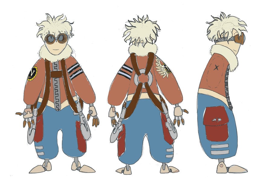
Beginners tend to find drawing turnarounds to be a frustrating process but as they progress, they will find that turnarounds help in a lot of ways when the need to draw their characters in motion or pose from different perspectives grows. For example, the three-point turnaround help keeps you from guessing what the character looks like from the back or the sides because you have the turnaround as reference.
Now the T-figure turnaround looks very similar to the three point turnaround but only with the missing arm when on the sides. The reason for the cut off the arm is because it enables them to do the details on the side of the torso where the arm was covering. Here is an example-
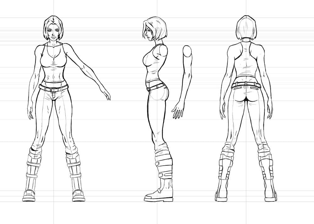
Next is the five-point turnaround. This turnaround is mostly used in animation where the importance of knowing exactly how a character would look like in different perspectives are a priority. The five-point turnaround provides a lot more information on a character’s look when compared to the three-point or the t-figure turnaround mainly because of the 3/4 front and back poses, which are more difficult to draw. Here are some examples of the five-point turnaround.
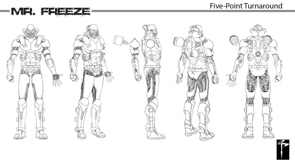
As soon as you have a good understanding of how the turnaround work and had a good practice with it, you should really be able to draw a character in at least a couple of poses facing different direction. Why not try your hand and have your characters do some action poses. Just to make things clear, action poses cover many things in general and not specific to punching, kicking, or jumping. Sleeping, sitting, laughing, coughing, hailing a cab, answering the phone is also considered as action pose, so try not to limit yourself.
At this point, there is only one thing left to do which is – practice, practice, practice. Only by improving what you have learned so far can you do better at creating characters for your comic. See you at the next chapter!
Submit your review | |
